Kompano, the Autonomous Greenhouse Robot
Redesigned app for operators to control the autonomous robot in a greenhouse by providing an overview, simplifying interactions, and making them feel in control
 Analyze data and draw insights
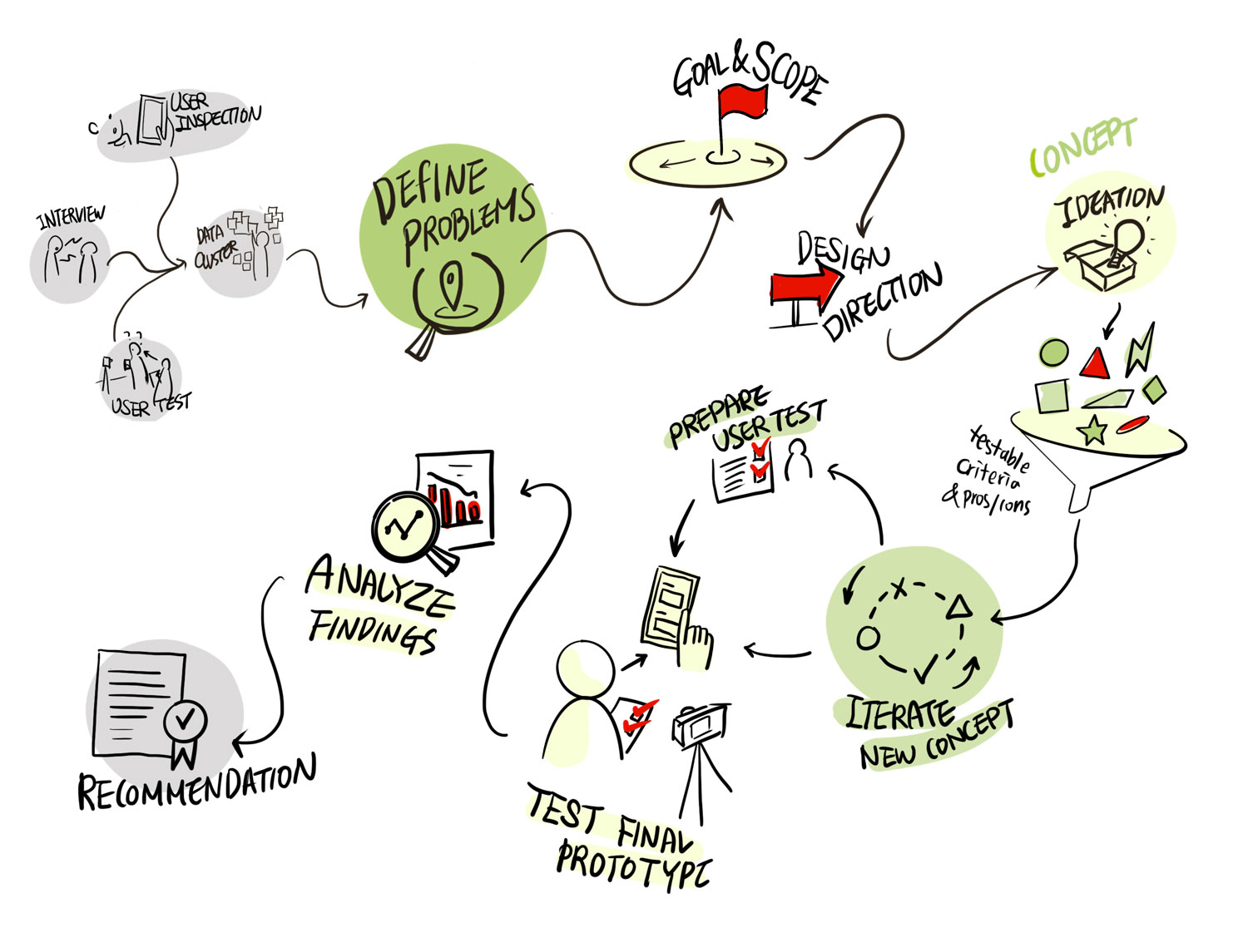
 Visualize problems with storyboards
 Ideate interaction concepts
 Prototype a new design with Figma
 Structure the project’s logics for reports, questioning “why.”
Category
Academic / Team
Type
Product / UX / UI
Scale
Robot : 1910mm(L) 880mm(W) 1800mm(H)
Period
Feb. 2022 – Jun. 2022
The course from UXAD (User eXperience Analysis and Design)
Role
Design Research, Concept, Prototyping, Evaluation
Client
PRIVA
Worked with
Kristin, Lea, Natanya, Celine
Supervised by
Arnold Vermeeren
Sergej Schetselaar
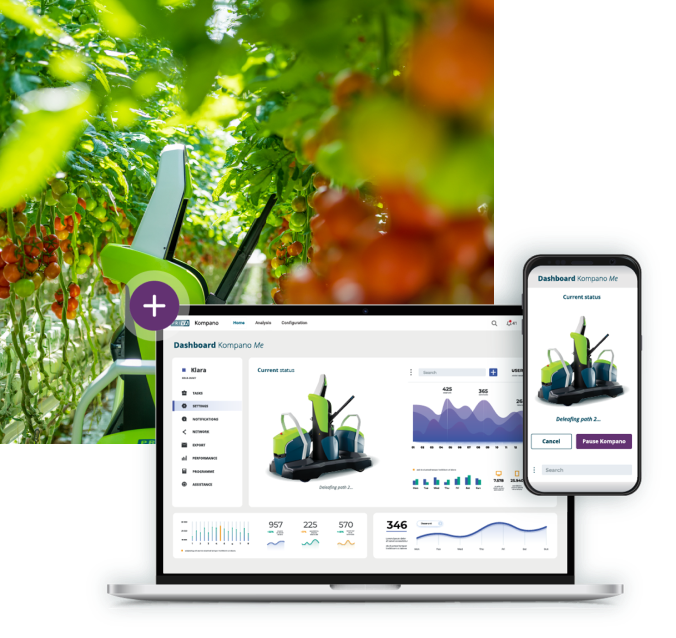
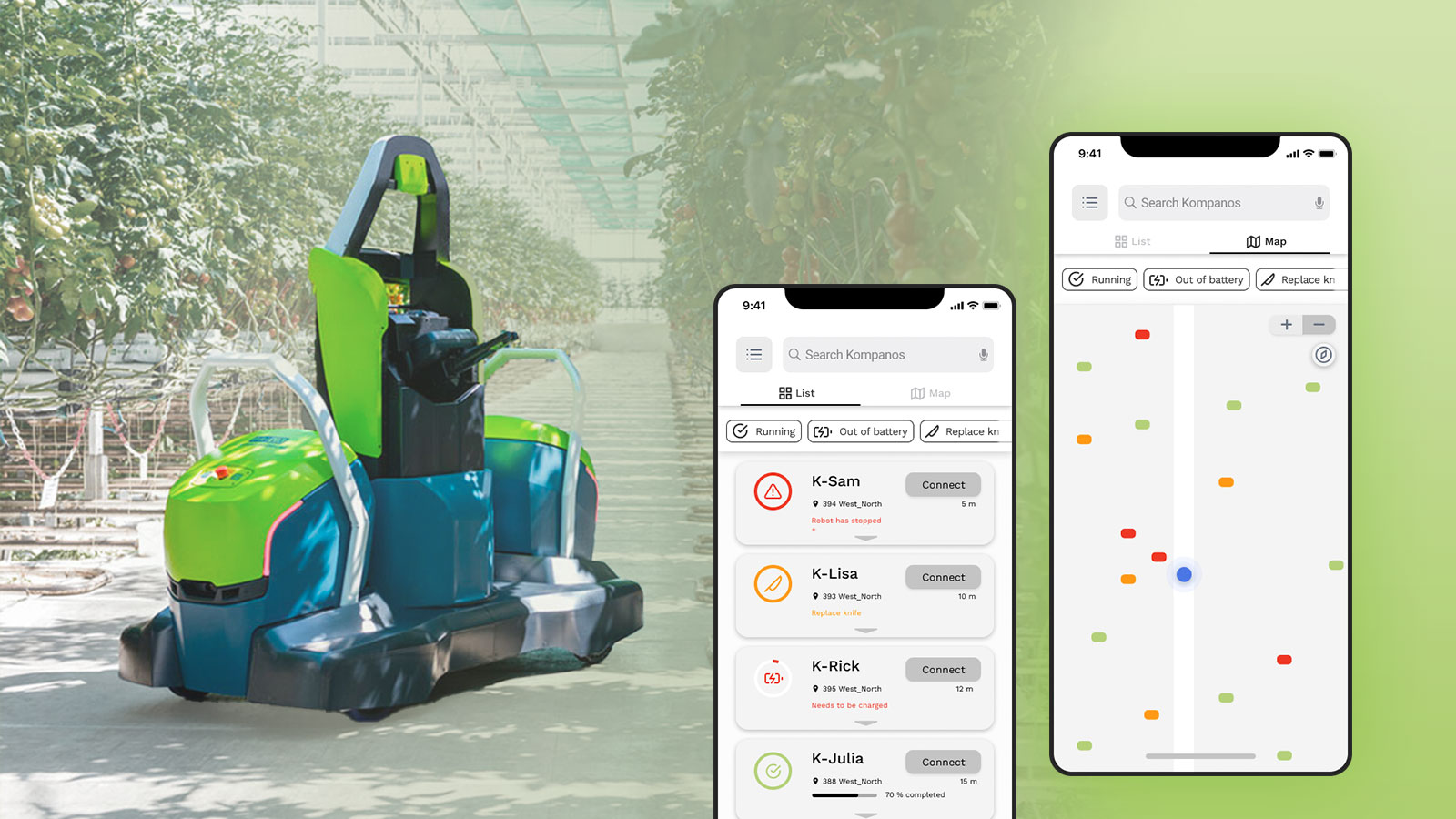
The robot designed for deleafing tomato plants in greenhouses
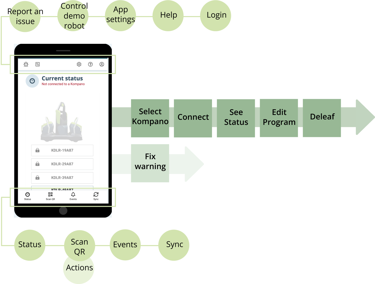
It cuts back the older leaves from the tomato plant to provide more sunlight to the tomatoes and facilitate harvesting. The Kompanos are controlled and monitored by the Kompano Mobile App. An operator uses the app to scan for nearby robots and connect with a robot via Bluetooth to operate it.
More information about the robot is H E R E .

Priva is a well-established firm leading the market of high-tech products for the horticultural industry. The Kompano is the first solution for a fully automated deleafing system, representing a significant achievement and advantage for the company. However, it also represents a challenge in controlling the app connected to the Kompanos because of its experimental technology, which is easily subjected to technical issues and unexpected malfunctions.
Project Overview
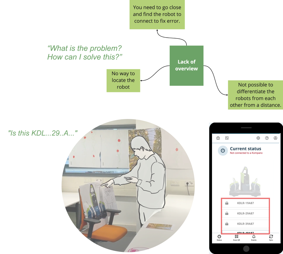
Finding 1.
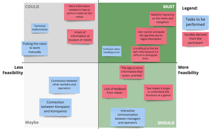
Lack of Overview
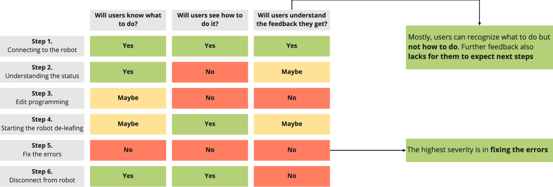
Differentiating the names of Kompano was challenging because the code names looked similar. Moreover, to fix the errors, the users needed to go close to each Kompano in person.
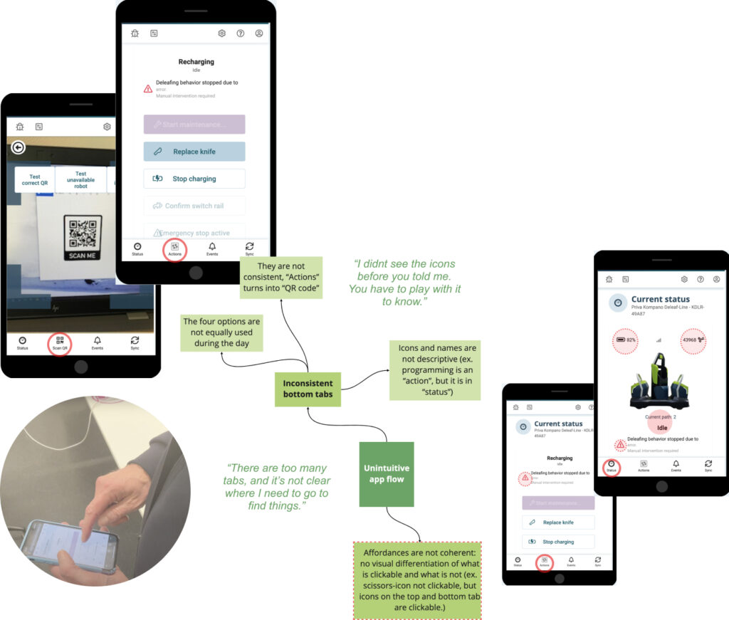
Finding 2.
Unintuitive app flow
The inconsistent bottom tab confused users. In addition, the terminology was confusing for users to understand what the features exactly do. This led to inconsistant affordances to users.
Finding 3.
Confusion when handling errors
Error descriptions showed insufficient instructions to solve them. In addition, the feedback lacked as some users tried to touch some icons because some were not clickable. Even when the problem was solved, the feedback was unclear.
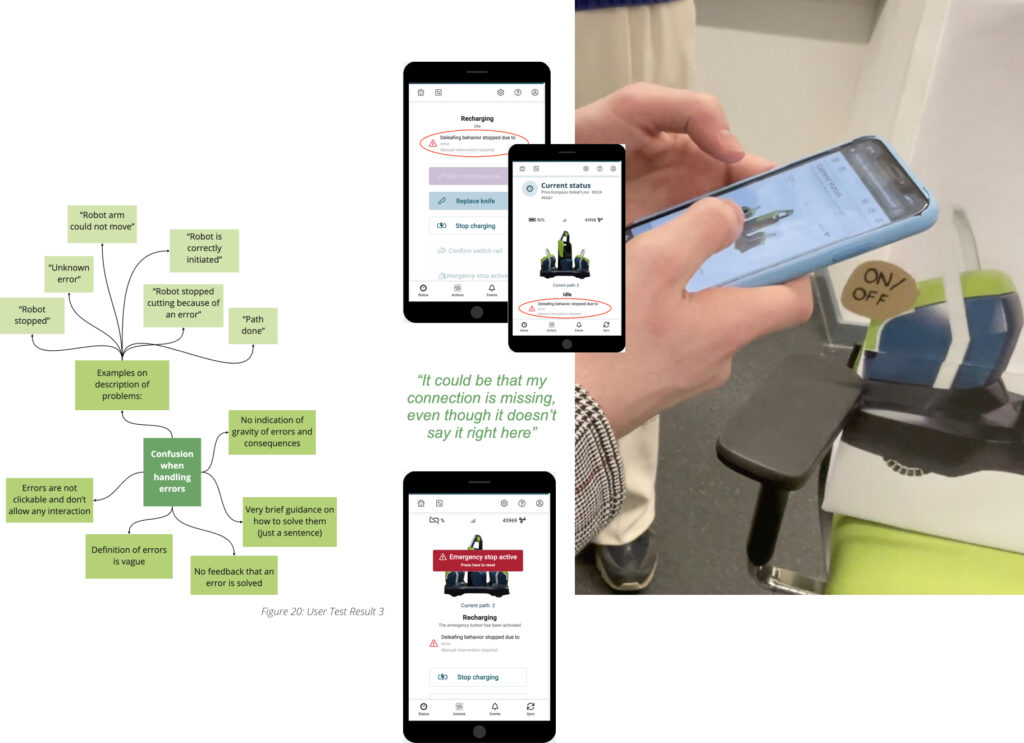
Finding 3.
Confusion when handling errors
Error descriptions showed insufficient instructions to solve them. In addition, the feedback lacked as some users tried to touch some icons because some were not clickable. Even when the problem was solved, the feedback was not clear.

Scoping the Problem
Problem Statement
The operator lacks overview to operate the Kompanos efficiently.
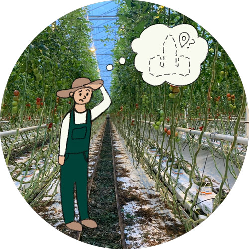
Locating the robots
Understanding robots' status
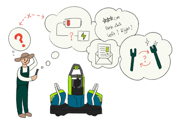
Fixing errors
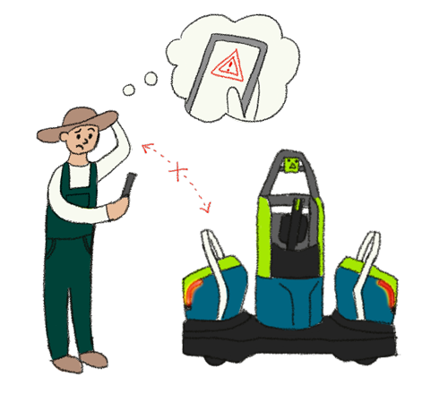
Definition of ‘overview’
- Location and status of the Kompanos
- All actions that the operator needs to perform
Design Goal
Provide the operators with
1) an overview, 2) simplified operator-Kompano interactions, enhancing operational efficiency, and 3) a sense of feel in control.
Conceptualization
We used Crazy 8 (from one of Google’s design methods) to create a new concept of redesign. Moodboards were used to visualize “feeling in control”. With the chosen moodboards, Crazy 8 was used to come up with as many ideas as possible in limited time.
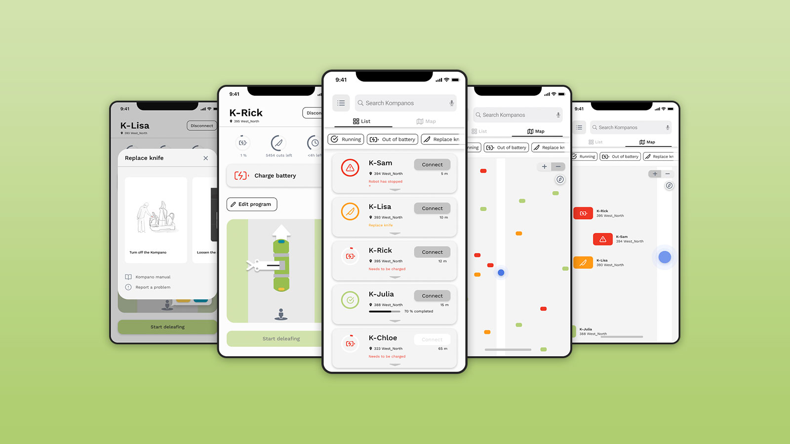
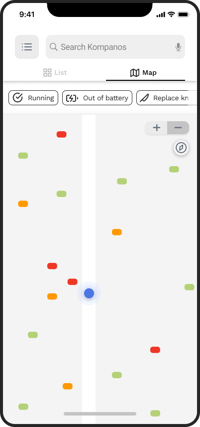
Maps for visual communication
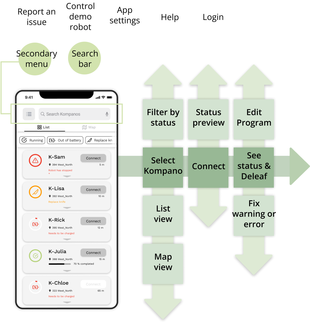
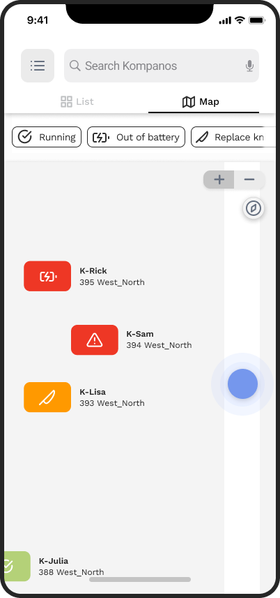
The map provides the operator with an overview of the location and the statuses of the Kompanos. Since every greenhouse has a different layout, the map is highly simplified, so it displays only the primary path and a compass to indicate the direction. The map has a blue dot to mark the operator’s position.
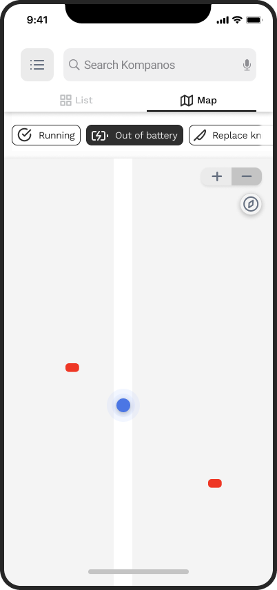
List for a quick overview of the robot’s status
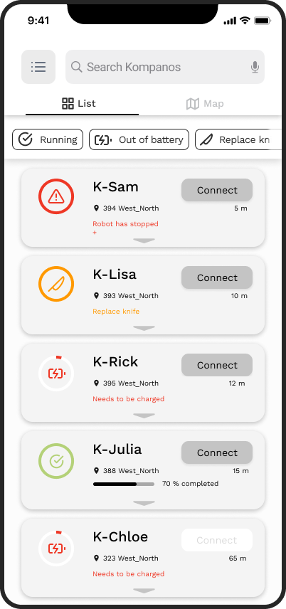
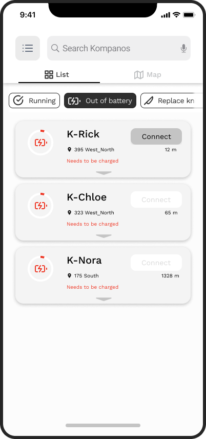
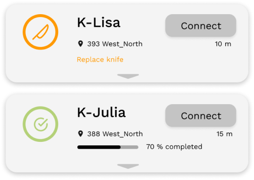
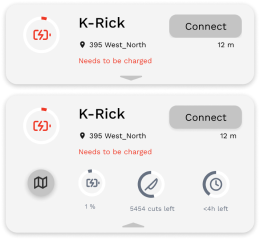
To quickly find the Kompanos with the same status, the app has a filter function to group all Kompanos that are running, out of battery, have a consumed knife, etc. The order of the filters is sorted after occurrence, providing a hierarchy of the most common statuses. In the list, the Kompanos are organized by an algorithm based on priority of intervention. The algorithm will take into account the position of the Kompanos compared to the operator, and the urgency of the error.
Visualization of the program
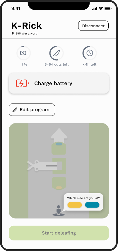
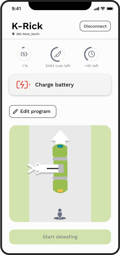
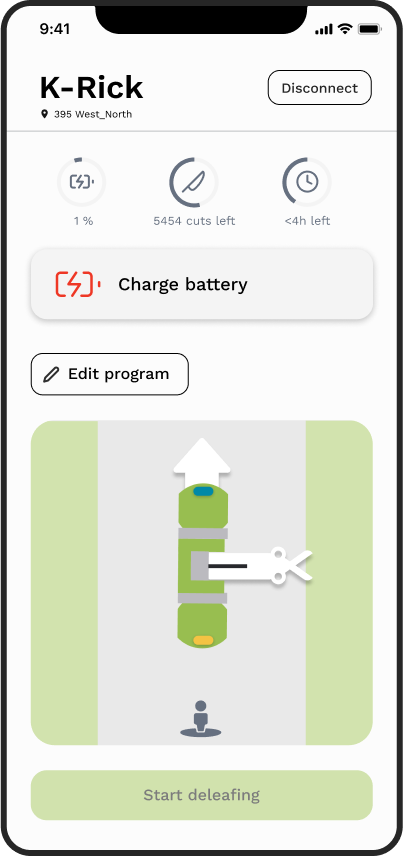
The program of the Kompano is based on moving forward and backward, cutting on the left and the right side. These parameters vary according to which side of the Kompano the operator is standing on the path. These settings are visualized here to make it more intuitive for the operator to understand the current program.
The visualization relies on the Kompano being physically slightly different on each side. The Kompano will have a yellow sticker on one side and a blue on the other.
Guidance in handling errors
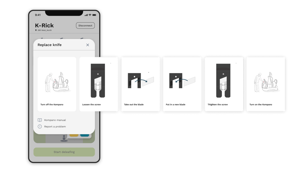
Error handling is designed as a step-by-step guide to increase the operator’s feeling of control. The step-by-step guide is beneficial for new operators and operators who are less fluent in English, providing them with a visual explanation of what they need to do.
Design Validation
54.4 point improved in usability (The SUS Score)

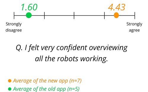
Having an overview
Time efficiency increase
Feeling of being “in control”

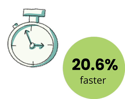
Time efficiency increase
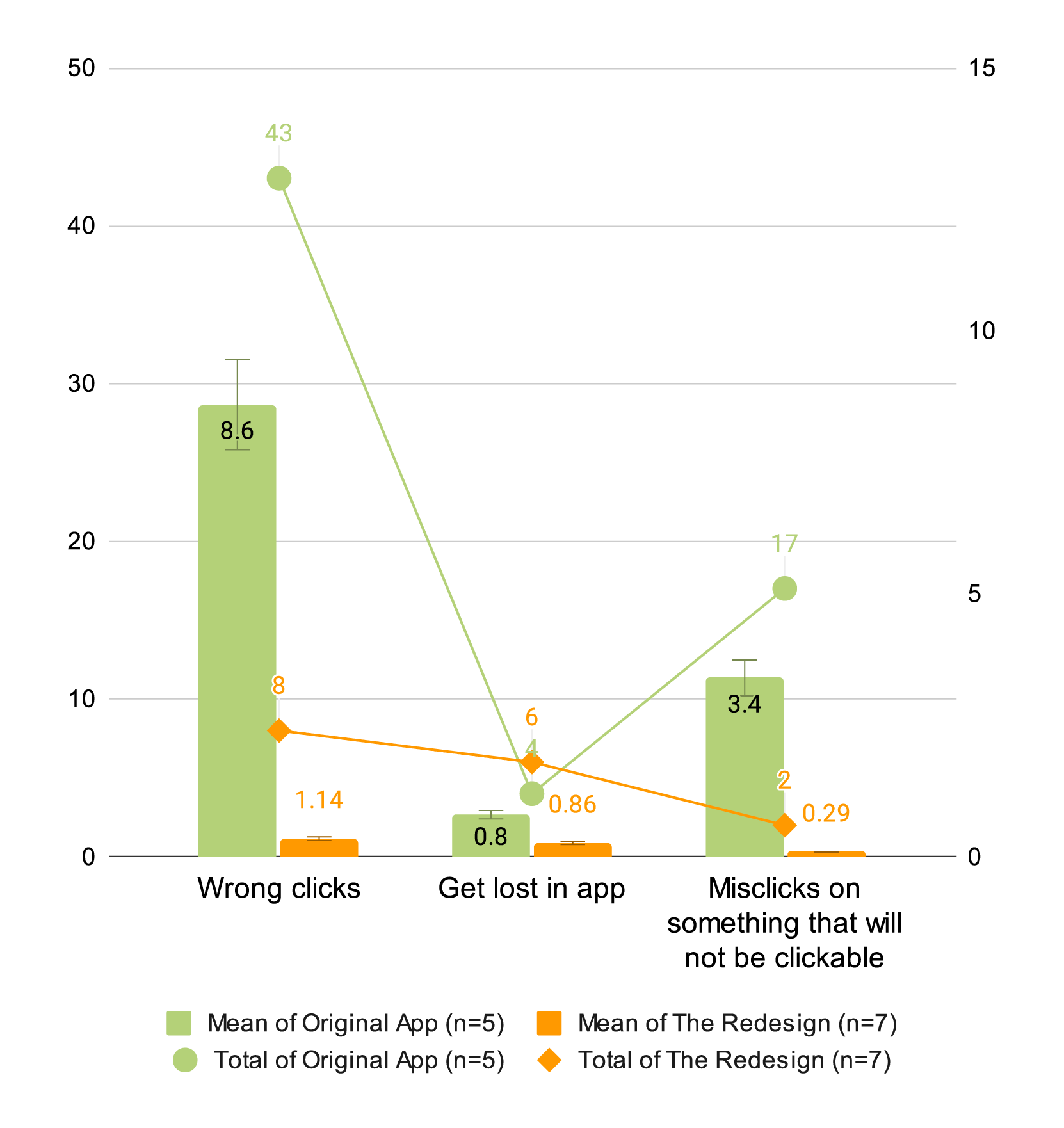
- The number of times that participants did not click the correct button decreased by an average of 7.1 times.
- Clicking times on a non-interactive element is decreased to an average of 3.1 clicks.
- Participants got lost on average 0.1 times more in the redesign.
Takeaways
Some participants did not understand how the visualization of the program works. They also did not realize that the arrows were clickable. The test shows that the user will need more time to get used to that type of visualization and learn how it can be managed.
In addition, the map has room for further development. The map could be standardized in different green houses. Due to greenhouses having different layouts, the map is limited to showing the main path, the position of the Kompanos, and the operator.
Inclusivity
We have focused on conveying visual information to make the app easier to navigate for people with limited language knowledge. Since the user group consists of multiple nationalities, inclusivity is an important matter.
Further testing
I learned that pre-testing helped our team to get the most out of our user testing before conducting it with participants. We could enhance our testing to the next level by conducting pre-pilot and pilot testing of the project. A benchmark test is also practical to ensure that our data is as comparable as possible. This has given more value to our results.
